Studio Rules
The rules my
AI agents follow.
Before an AI agent builds anything for me, whether a web page, an animation or a print layout, it reads these rules. Each one is a single sentence with its reason. When an agent gets something wrong, I add a new rule.
I write the brief and the rules · agents build · I check the work and sign offTwo inks.
Never white.
My work borrows from risograph printing, where each colour is a separate ink. Those limits are what make it look made rather than generated, so the agents keep them even on screen.
Two inks, three at most.
Riso is spot colour. A fourth ink starts to look digital.
New colours come from overlap.
Where two inks print over each other, and where they slip slightly out of line, that is the palette.
Paper is never pure white.
Pure white reads as a screen. Every background is a warm, uncoated paper.
Depth without effects.
Depth comes from offset, overlap and grain. No blur, glow, gradients or drop shadows.
Grain goes under the type.
Texture sits on its own layer. Letters stay sharp.
One accent per piece.
One loud colour carries the eye. Two will fight.
Start with
the type.
Every piece starts from a type decision, not from an image. Pictures support the words.
Named faces, fixed sizes.
Licensed typefaces only, set to a fixed scale. No sizes in between.
Land, then hold still.
In motion, type arrives on the beat and stops dead. Words that keep drifting look unfinished.
No text inside generated images.
All lettering is set by hand or in code, never by an image model.
Design first.
Footage small.
I use generative models for stills, props and short clips. They go into the design. They are never the whole frame.
Lead with shape and type.
Flat colour, drawn line and paper props read as art direction. Full-frame generated footage shows its tells.
Small, short, no faces.
Generated footage stays cropped inside shapes, and never shows faces or hands.
Said plainly.
Every piece is labelled AI-assisted under my direction. Nothing is passed off as photographed or hand-made.
The never
list.
Many designers now share lists like this one. These are the habits I see most often in AI-made work.
- No small labels stacked over headlines.Too common to mean anything.
- No purple or blue gradients, no glow.The default look of generated sites.
- No boxes inside boxes.Layout should come from type and space.
- No emoji as icons.They borrow someone else's style.
- No fade-ins on scroll, no parallax.Motion has to mean something.
- No invented quotes, clients or numbers.If it isn't real, it doesn't go in.
- No idea that needs explaining.If it takes more than one move to get, it gets cut down to one move.
- Nothing public without my yes.Agents never post, publish or send anything in my name.
Brief. Pick.
Sign-off.
The agent does the building. I make three decisions, and nothing moves past one of them without me.
I approve the brief.
The agent asks once for what's missing, then says back in two lines what it will make. Nothing gets built before I agree.
Three directions, I pick one.
Three truly different options side by side, with the agent's pick and its reason. A rejected direction is never blended back in.
Check, then I sign off.
Every build is rendered at phone and desktop size and checked against these rules until it passes. Then I sign off. Nothing ships without that.
Rules from
failures.
When an agent gets something wrong, I write down what it did, what I wanted and why. Then the lesson becomes a rule.
- Oct 2026
What happenedA reel built from full-frame generated footage felt “very AI”: stock scenes, uniform light, faces.
The ruleLead with type, colour and paper props. Footage stays small, inside shapes, with no faces.
- Nov 2026
What happenedAn animation idea grew too complicated to understand in 30 seconds.
The ruleOne move per idea. Agree on the audience, a reference and still frames before any motion is built.
Which model
prints in two inks?
I don't take a model's claims on trust. I gave four image models on fal the same two-ink brief, twice each, with no lettering allowed: a pink record, a blue disc printed over it, and a purple crescent where they overlap.
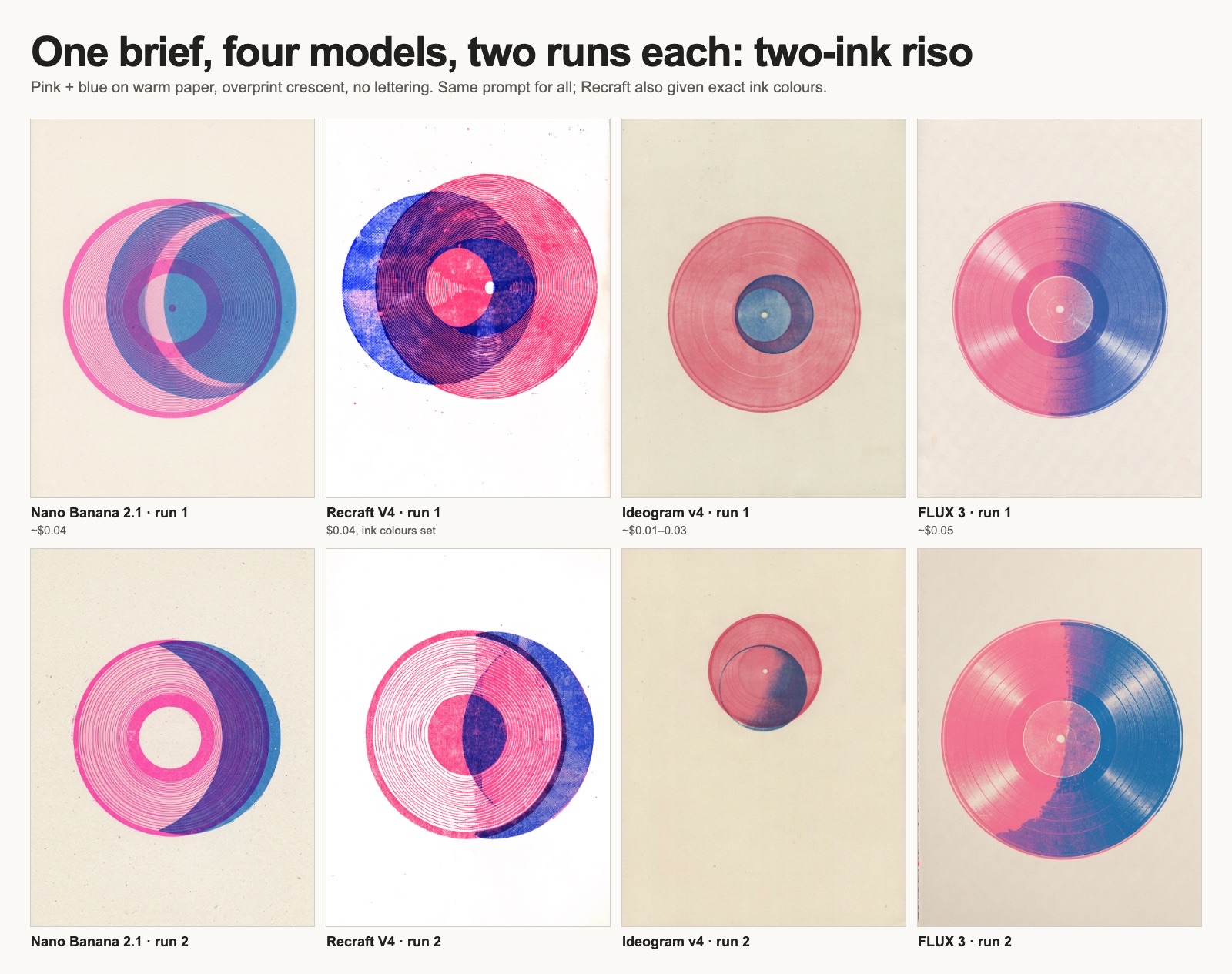
- Nano Banana: the one to use.Clean overprint, real misregistration, warm paper, both times.
- Recraft: best ink, wrong paper.The most convincing ink texture, but it forced pure white paper even when I gave it the paper colour.
- Ideogram: washed out.No real overprint, and a third colour crept in.
- FLUX: gradients.A realistic record that fades pink into blue, which my rules ban.
Eight images, about $0.35 in total. Nano Banana now makes my two-ink artwork, as in Look up.
Borrowed,
with thanks.
This file follows patterns that designers and engineers have shared openly. Below are the ones it learned from.