Fishwife
A postcard you can eat.
A spec campaign for the LA tinned seafood brand. Every tin becomes a postcard from the coast it came from, told in collage: a 15-second animation, three posters and three product photos.
Creative direction · Collage animation · Poster design · Product photo direction · CopyEvery tin is
somewhere else.
Why this idea, for this brand.
The brand
Fishwife was founded in Los Angeles in 2020, inspired by sardines and conservas on the Iberian peninsula. Its tins, illustrated by Danbo, broke from the blue-and-white look of the category, and the founders treat that artwork as the one locked part of the brand.
The insight
Conservas began as a way to carry the coast inland. Every tin holds a small piece of somewhere else: a harbor, a market, a long lunch. Opening one is the cheapest trip you’ll take this week.
The idea
A postcard you can eat. The campaign is built like a scrapbook from a trip, with stamps, ticket stubs, torn maps and photo cut-outs, and the tin is the souvenir.
Respect the locked art.
Nothing here imitates Danbo’s illustration or recreates Fishwife packaging. Tins are shown unlabeled, so the tin art keeps its own job.
Collage as the campaign layer.
Photo cut-outs and torn paper are a separate visual voice that frames the product without competing with it, and they work in motion, print and social.
Postcard language.
“Greetings from,” “Wish you were here,” postage and postmarks: a vocabulary everyone already knows, bent toward food.
Peel. Fly.
Pull up a chair.
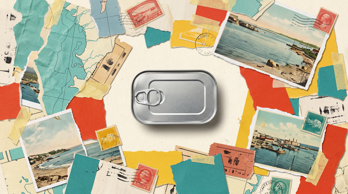
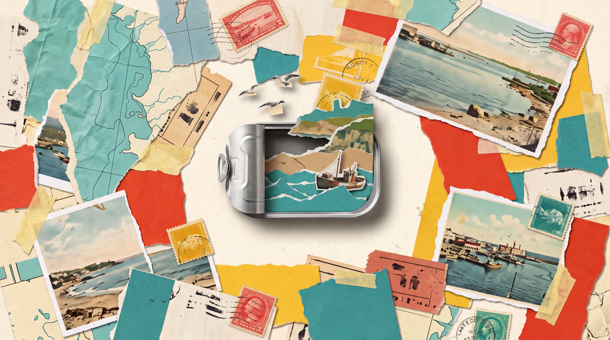
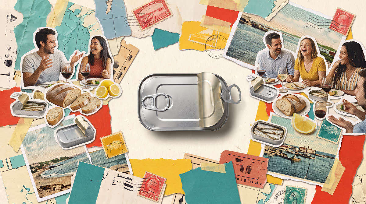
A plain tin on a table of postcards peels open, and a torn-paper coastline unfolds out of it as gulls cut from photographs fly through. Then the table fills with friends, bread and lemons. Played at 12 frames per second with a little paper jitter so it moves like hand-cut collage. Plucked guitar, claps and gulls on the score. The 4:5 cut is the same master.
Three postcards
for the street.
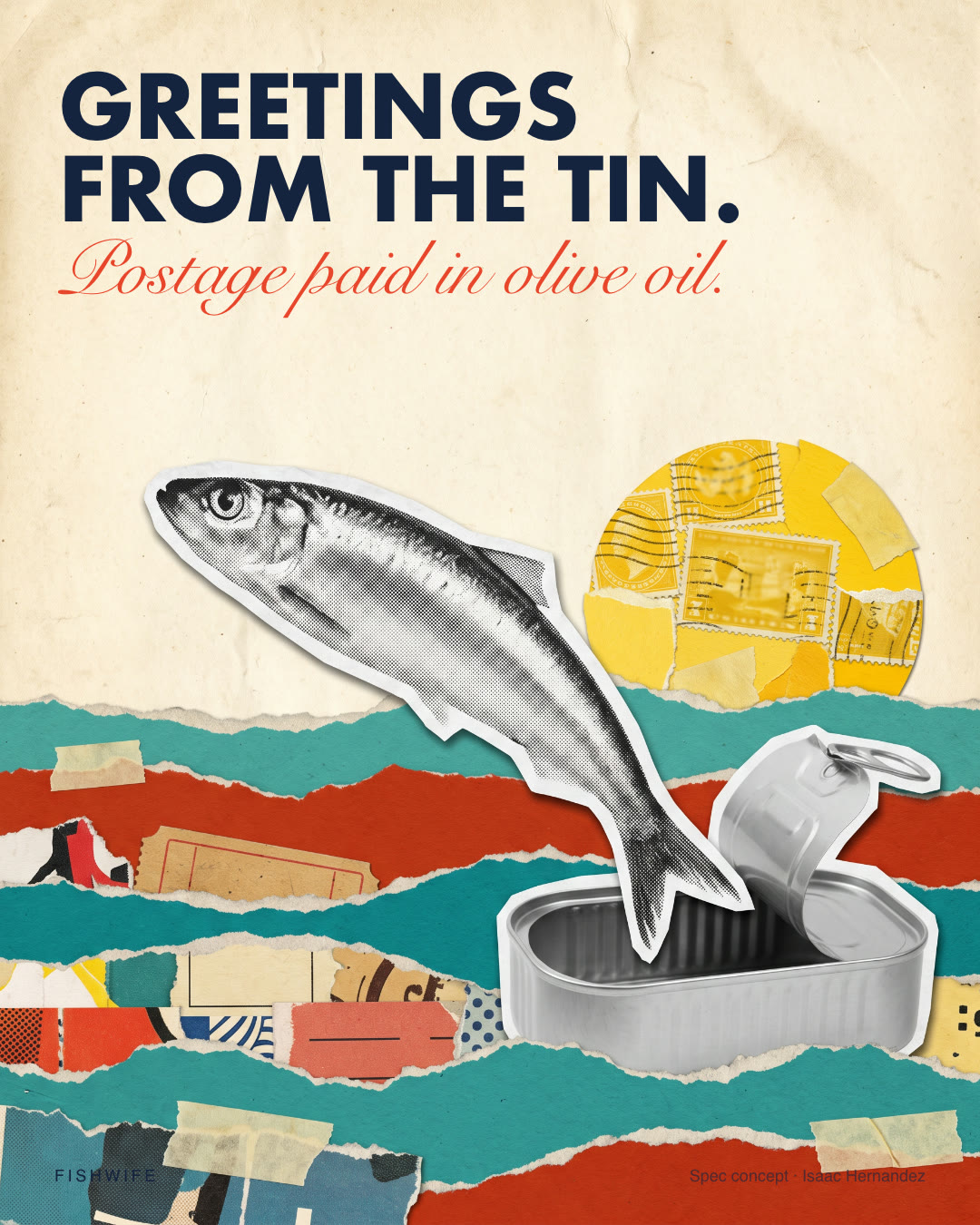
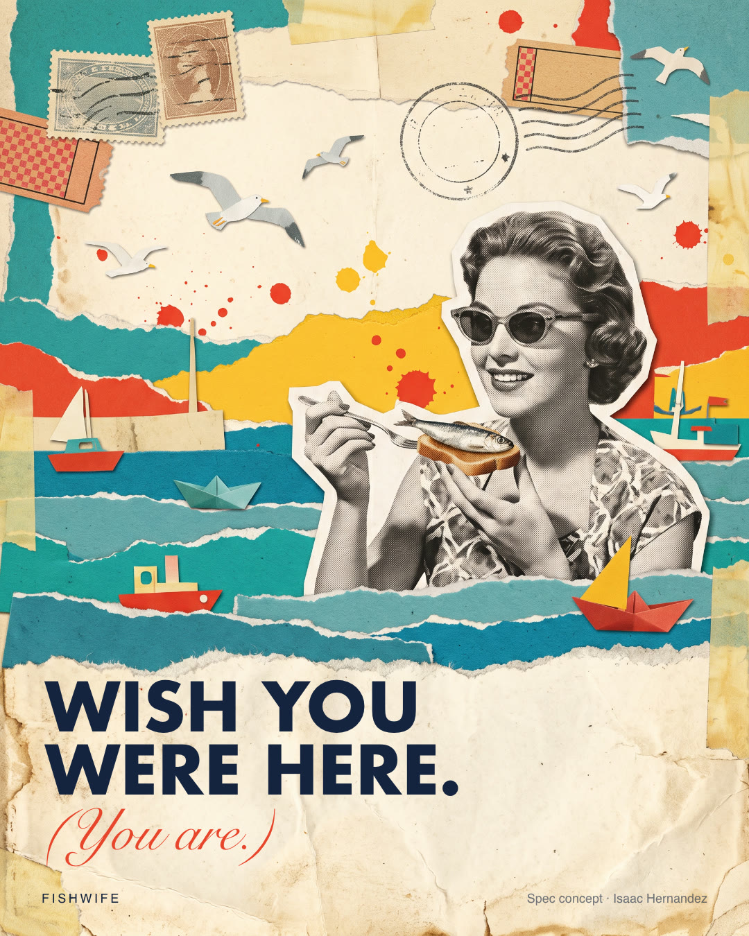
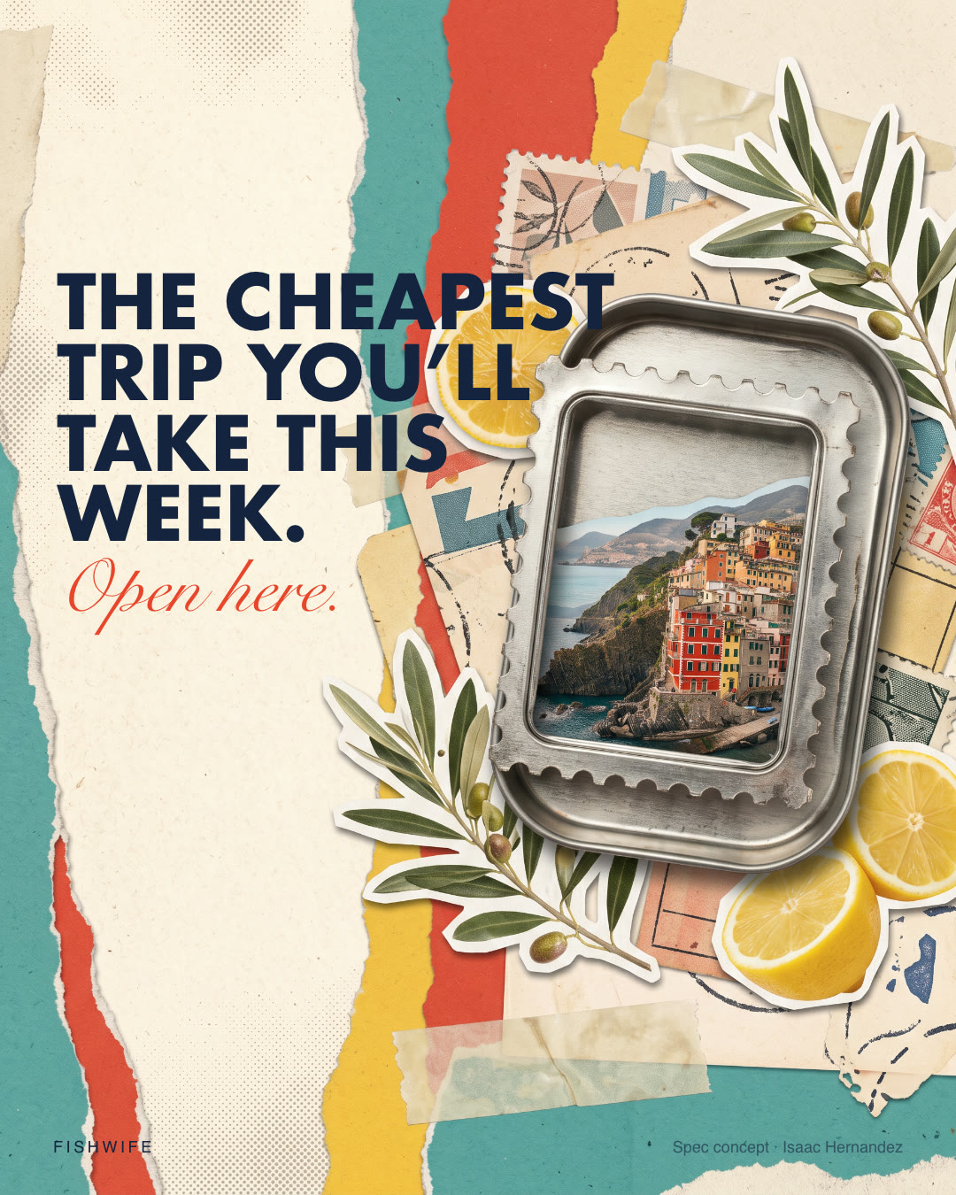
Each poster pairs one collage with one postcard phrase, set in a heavy geometric sans with a script aside in tomato red. They work as wheat-pastes, shelf talkers and feed posts.
A sleeve, not
a new label.
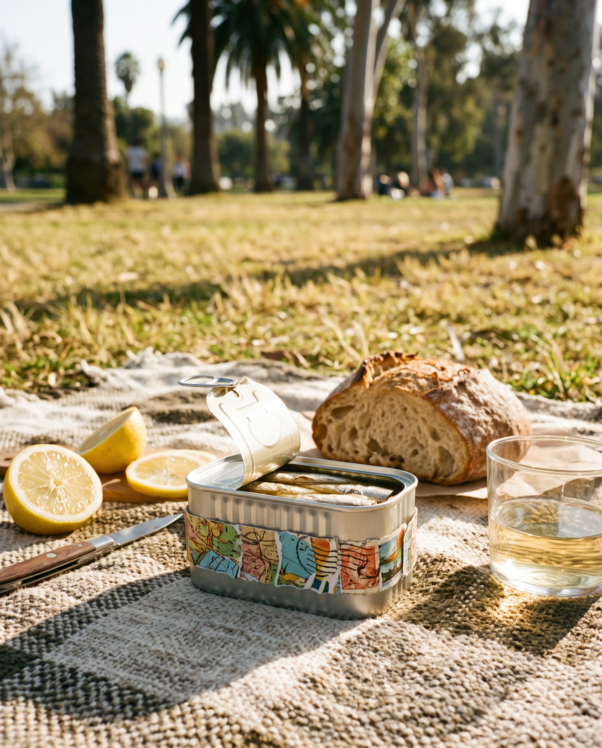
The one physical piece: a collage paper band that wraps any tin for gifting and events, leaving the original label alone. Shown here on unlabeled tins at a picnic, a wine bar counter, and on its way into a mailbox.
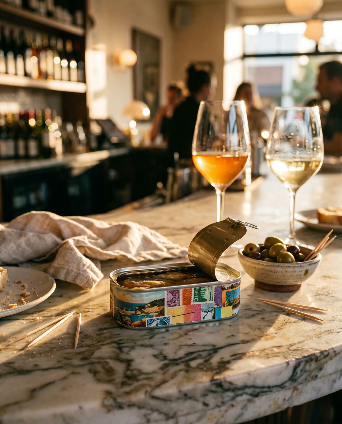
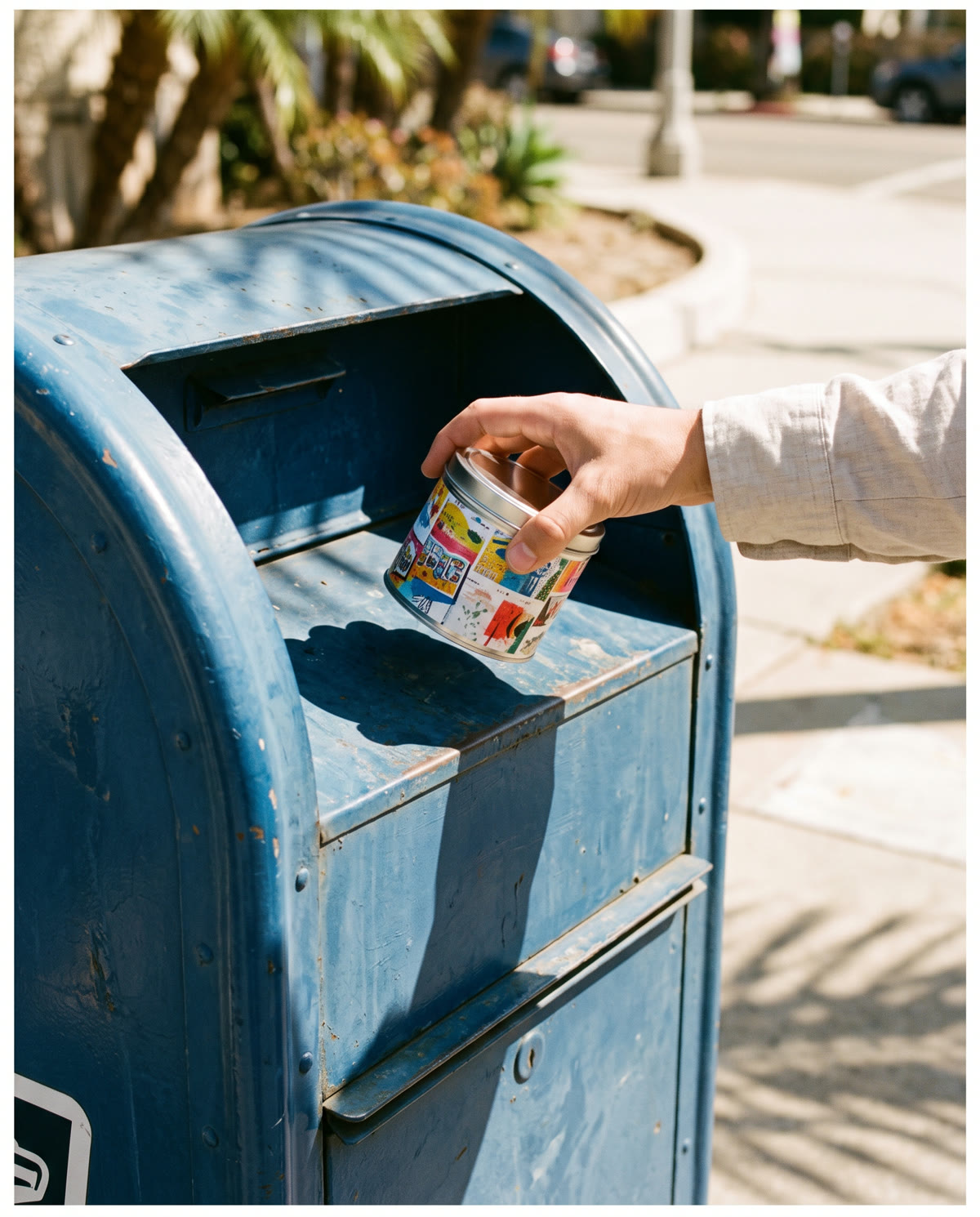
A postcard you can eat.
Poster linesGreetings from the tin. Postage paid in olive oil. · Wish you were here. (You are.) · The cheapest trip you’ll take this week. Open here.
- Sent from the coast. Delivered to your toast.
- No passport. Just a pull tab.
- Tag who you’d mail a tin to.
A postcard band with a write-on back: “To ___, from the coast of ___.”
Collage animation · 16:9 and 4:5
The 15-second spot and its feed cut.
Three collage posters
Wheat-paste, shelf and social formats.
Product photos with the postcard band
Picnic, wine bar and mailbox.
Postcard band for gifting
A printed wrap with a write-on back, sold in sets or given at events.
“Mail a tin” day
A pop-up where people post a banded tin to a friend, with postage covered.
Real collage shoot
The film rebuilt by hand with paper and real tins under a rostrum camera.
The best campaign for a brand with great packaging is one that leaves the packaging alone and gives it somewhere to go.
Project scope & production notes
What this covers
Campaign idea and copy
Collage animation direction and edit
Poster design and typography
Product photo direction
Rollout plan
What it is not
An unsolicited spec concept, not commissioned or approved by Fishwife. All imagery, animation and music are AI-generated (fal.ai: nano-banana 2.1, minimax h3, stable-audio 2.5), then art directed, typeset, edited and finished by hand. No Fishwife packaging or Danbo artwork is shown or imitated, and the people pictured are not real.
Concept, art direction, copy, type and edit: Isaac Hernandez. Imagery, animation and music generated with AI models under his direction.
Sportiefs Matcha
Every good day has a warm-up.