TuCha
A sweeter pause.
A tea-and-dessert campaign built from steam, a clay arch and a gradient that moves from matcha to milk tea.
Campaign direction · Hero + story design · Rollout plan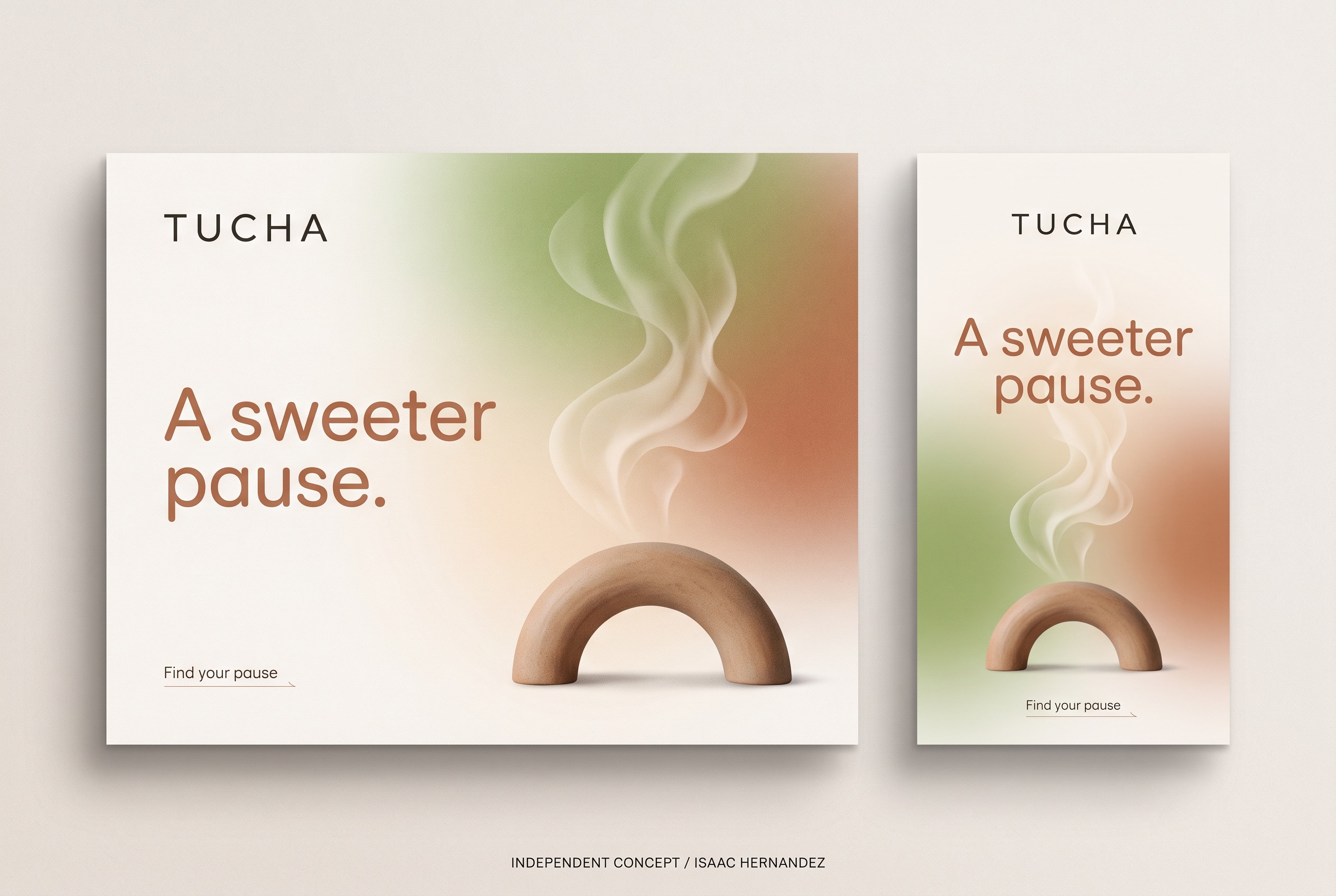
A sweeter pause.
Why this line, for this business.
The business
TuCha tells the story of tea evolving from raw ingredient to modern ritual, pairing drinks with desserts.
The goal
Turn ‘tea and dessert’ into a moment people can picture — a short, sweet break — so every seasonal drink has a campaign home.
The central idea
The pause is the product. Steam is the only ‘ingredient’ shown; a single clay arch stands in for the cup, the counter, the doorway. The gradient carries the menu — matcha, cream, milk tea — without naming a single drink.
Steam instead of drinks.
No cups or desserts, so nothing is passed off as the real menu. Steam reads instantly as warmth and ritual.
One rounded sans.
A geometric sans with soft terminals in warm clay. It sits between tea-house calm and modern café energy.
Gradient as menu.
Green, cream and clay in one wash. Seasonal drinks shift the balance of the gradient rather than changing the layout.
Steam, arch, gradient.
Three elements and a headline. A new drink or dessert gets a new gradient balance and a new line; the arch and the steam stay, which is what makes the series recognizable on a feed.
Tracked wordmark top-left, rounded-sans headline, arch at the base with steam rising from it, underlined CTA.
Gradient balance (greener, creamier, warmer) and the headline for the season or the pairing.
Landscape keeps the headline left and the arch right. Vertical centers both and lets the steam run the full height.
Two formats.
One identity.
The landscape hero and the vertical story were designed together so the campaign reads the same on a website banner and on a phone. This is the completed, deliverable artwork; everything in section 05 builds on it.
Words that match
the pictures.
Starter copy in the campaign’s voice — a headline, a supporting line, three social captions and an email subject. Written to show the tone; the business would refine every line.
A sweeter pause.
Supporting lineTea the way it was always meant to be taken: slowly, and with something sweet.
Call to actionFind your pause
- Steam up. Phone down. A sweeter pause.
- Matcha, milk tea and the dessert that goes with it. Find your pause.
- From leaf to ritual, one cup at a time.
A sweeter pause — new pairings at TuCha
Completed assets.
Proposed extensions.
The two completed pieces are the complimentary concept. The rest is how the idea could grow if the business wants to take it further — each would be scoped separately and built from approved brand assets.
Campaign hero · 3:2
The landscape design on the board above.
Vertical story · 9:16
Centered story version with full-height steam.
Motion cut
Steam drifts; the gradient warms; the headline settles. Six seconds, loopable.
Seasonal series
Three gradient balances for three seasonal pairings, delivered as matched hero + story pairs.
Menu board + counter card
The arch-and-steam device carried onto an in-store menu header and a small counter card.
The second gradient is the proof: if a warmer wash still reads as TuCha, the series works for every season.
Project scope & production notes
What this study covers
Campaign idea
Visual direction
Hero + vertical story design
Sample copy and rollout plan
Created as a complimentary, self-initiated concept and shared with the business as a proposal.
What it is not
An independent concept for a real business, created without its involvement. The artwork is AI-assisted and illustrative; it does not depict TuCha’s drinks, desserts or premises.
No commission, client approval or measured results exist for this work. Motion, print and email items in the rollout are proposals only.
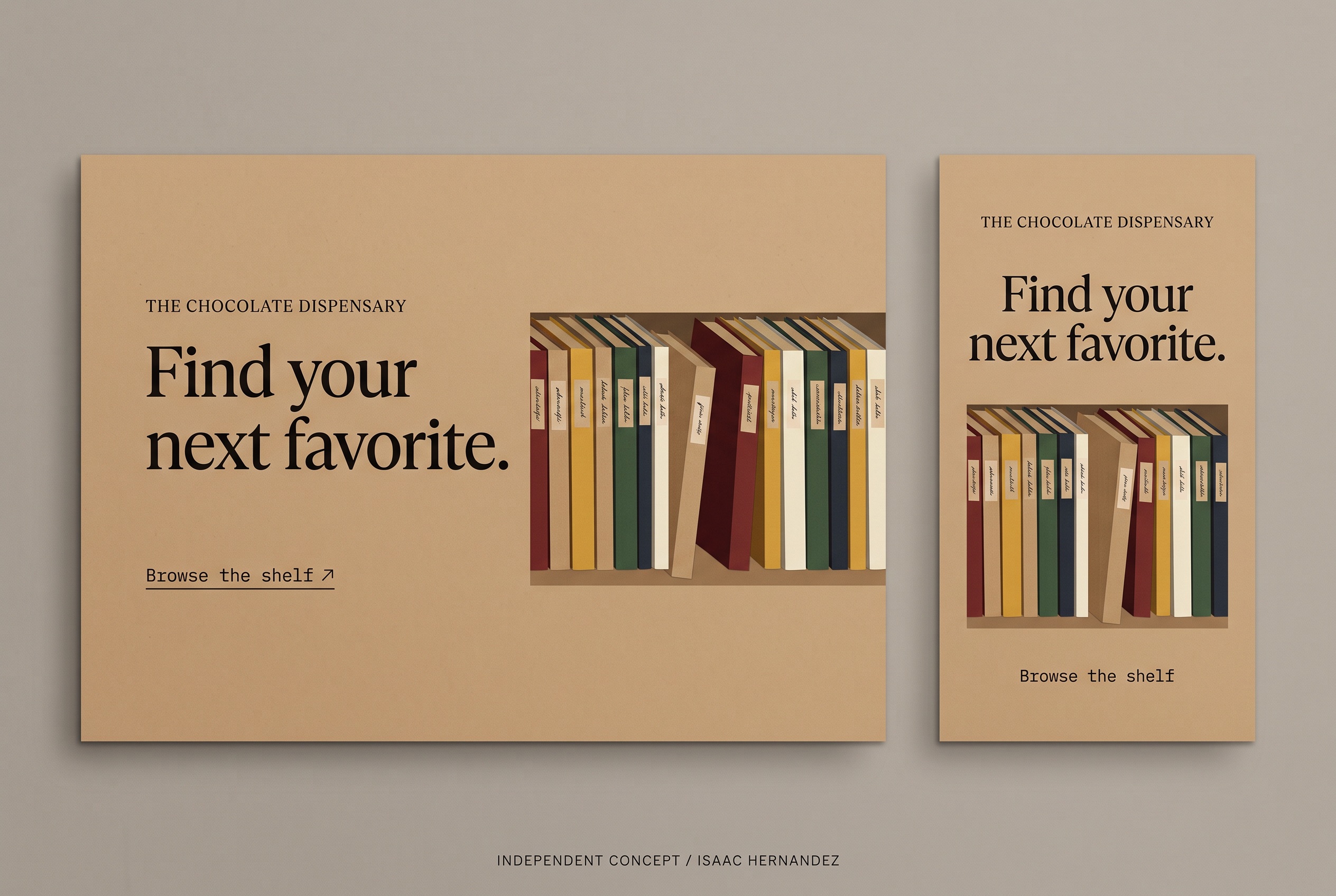
Chocolate Dispensary
Find your next favorite.