Chocolate Dispensary
Find your next favorite.
A discovery campaign that treats craft chocolate like an independent bookstore — a shelf of spines, one pulled forward.
Campaign direction · Hero + story design · Rollout plan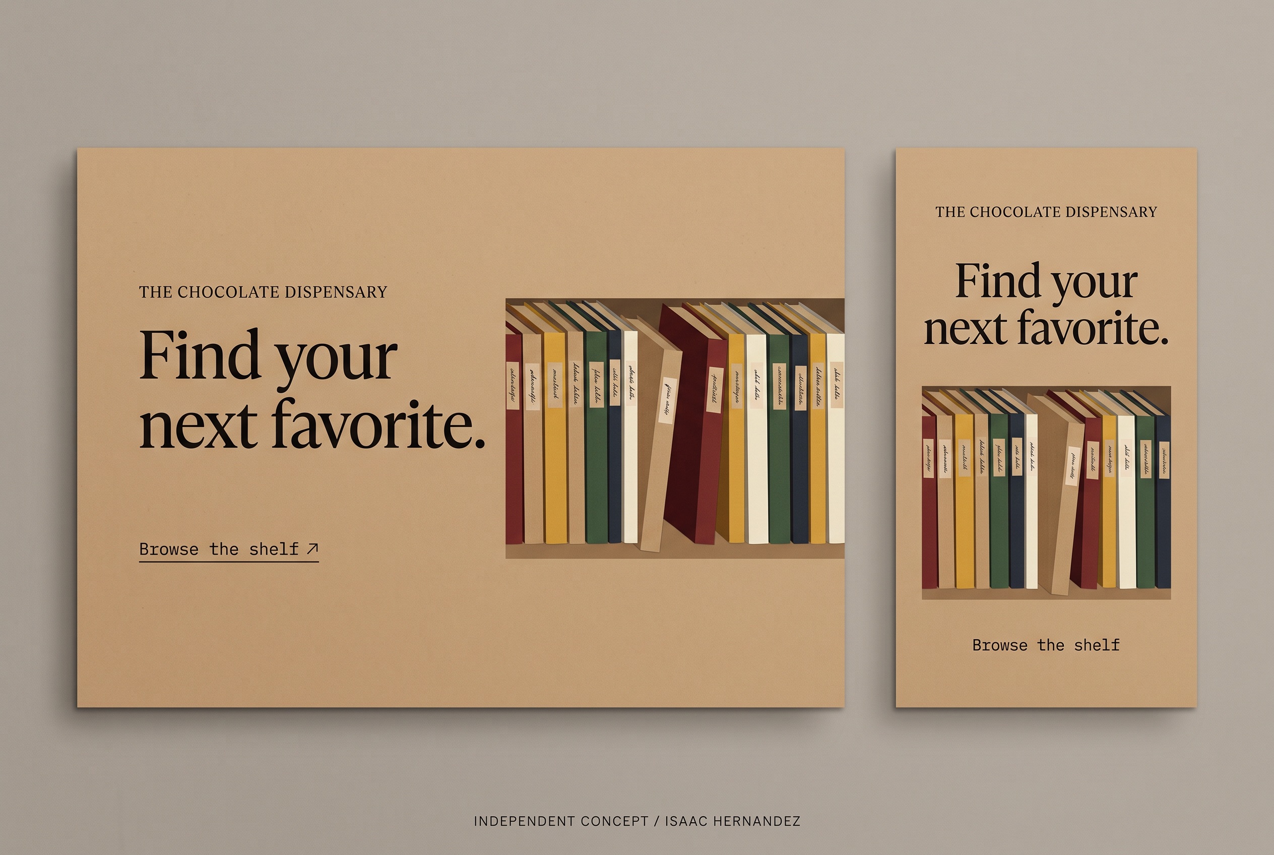
Find your next favorite.
Why this line, for this business.
The business
The Chocolate Dispensary curates craft chocolate the way an independent bookstore curates titles — by taste, origin and maker, with staff picks.
The goal
Make discovery the offer. Give the shop a campaign that says ‘browse’ rather than ‘buy’, and that can carry staff picks and new arrivals every month.
The central idea
If the shop is a bookstore, the bars are spines. The hero illustrates a shelf of unlabeled, color-blocked spines with tiny handwritten index tabs and one pulled forward — the moment of finding the one you didn’t know you wanted.
Spines, not bars.
A flat illustration of abstract spines keeps every maker anonymous and nothing misrepresented. Real wrappers can replace them in a later round.
Bookish typography.
A classic serif for the headline, small caps for the shop name and a typewriter face for the CTA — the furniture of a good bookshop.
Kraft as the brand field.
One warm paper color across hero and story. The spines supply all the color; the field stays calm.
A shelf that changes every month.
The shelf is the template. ‘Staff pick’, ‘new arrivals’ and ‘single origin’ each become a shelf with one spine pulled forward and a different index tab — the same picture, a new reason to come in.
Kraft field, small-caps shop name, serif headline, typewriter CTA, illustrated shelf with exactly one spine pulled forward.
Spine colors and count, the index-tab text, and which spine is pulled. Headline changes with the monthly theme.
Landscape puts type left and the shelf right, bleeding off the edge. Vertical stacks type over a contained shelf.
Two formats.
One identity.
The landscape hero and the vertical story were designed together so the campaign reads the same on a website banner and on a phone. This is the completed, deliverable artwork; everything in section 05 builds on it.
Words that match
the pictures.
Starter copy in the campaign’s voice — a headline, a supporting line, three social captions and an email subject. Written to show the tone; the business would refine every line.
Find your next favorite.
Supporting lineCraft chocolate, curated like a bookshop. Browse by maker, origin and the staff’s current obsession.
Call to actionBrowse the shelf
- You came in for one bar. You’ll leave with a new favorite. Browse the shelf.
- Staff picks, new arrivals and a few we can’t stop talking about.
- Every bar has a story. Some of them end with you.
Find your next favorite — this month’s shelf
Completed assets.
Proposed extensions.
The two completed pieces are the complimentary concept. The rest is how the idea could grow if the business wants to take it further — each would be scoped separately and built from approved brand assets.
Campaign hero · 3:2
The landscape design on the board above.
Vertical story · 9:16
Stacked story version with a contained shelf.
Monthly shelf template
A reusable layout where the pulled spine and index tab change for each staff pick or new arrival.
Stop-motion cut
Spines slide onto the shelf one by one; the last one is pulled forward. Six seconds.
Shelf talkers + gift tag
Small in-store cards in the same kraft-and-typewriter language, plus a matching gift tag.
The monthly template is the real deliverable: one shelf, one spine pulled forward, a new reason to come in every four weeks.
Project scope & production notes
What this study covers
Campaign idea
Visual direction
Hero + vertical story design
Sample copy and rollout plan
Created as a complimentary, self-initiated concept and shared with the business as a proposal.
What it is not
An independent concept for a real business, created without its involvement. The artwork is AI-assisted and illustrative; the spines are abstract and do not depict any maker’s bars or the shop’s premises.
No commission, client approval or measured results exist for this work. Motion, print and email items in the rollout are proposals only.
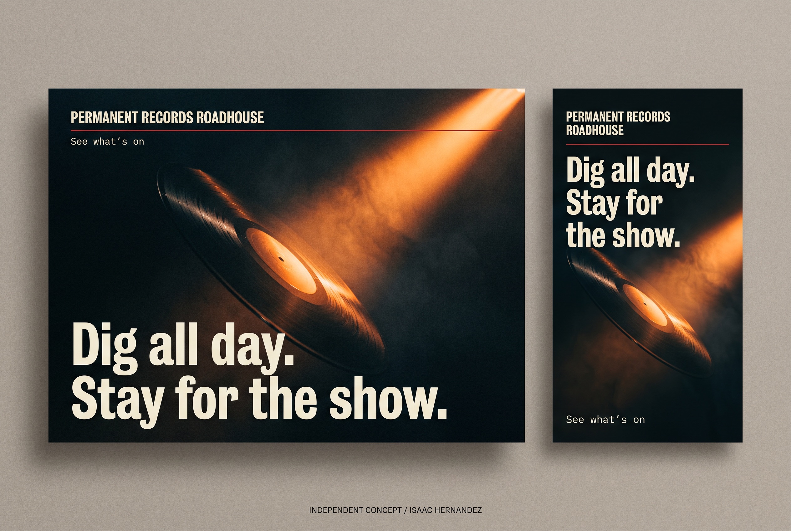
Permanent Records
Dig all day. Stay for the show.