SIDEQUEST
Take the
scenic snack.
A snack range and gift box built around the idea of a detour.
Brand identity · Packaging · PR gifting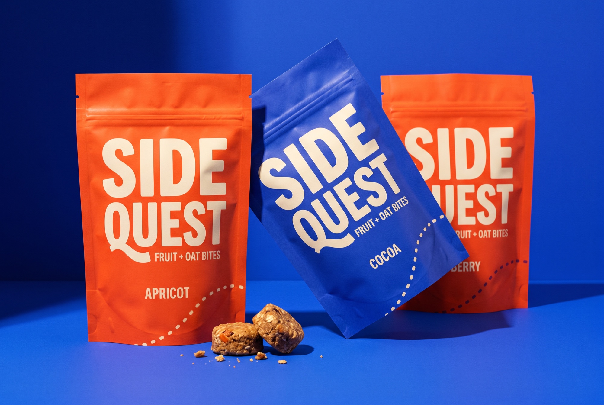
A snack break
worth wandering into.
The brief
Create a snack identity and gifting experience that turn a small everyday break into a moment of discovery.
The response
SIDEQUEST treats snacking as a welcome detour. The lettering is compact and playful; the long Q tail introduces a sense of movement. Cobalt and orange establish a bold contrast, while the warm cream type keeps the brand inviting.
Put personality in the letters.
The distinctive Q gives the wordmark a playful interruption. The name remains large and readable across the pouch range.
Create an opening sequence.
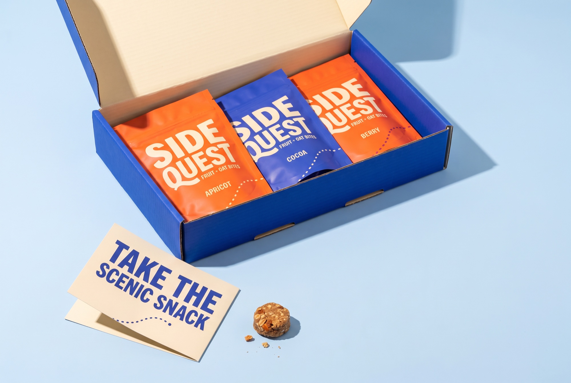
The gifting idea moves from a bold outer box to the assortment inside, then to a printed invitation to take a small detour.
Keep the flavor easy to find.
Large flavor names and a fixed category position give the playful system a practical information layer.
A little unexpected.
Everywhere it goes.
The stacked wordmark is the anchor. Contrasting color fields and a simple dotted route give the identity movement. The same few elements carry the pouch, the gift box and the campaign.
Stacked name, cobalt, cream lettering and a dotted route. Leave a clear area for the flavor.
Flavor, accent color and the route across the format. Keep the route away from product information.
Pouch: quick recognition. Box: a reveal. Insert: one invitation to take a detour.
QUESTAPRICOTFRUIT + OAT BITES
QUESTCOCOAFRUIT + OAT BITES
QUESTBERRYFRUIT + OAT BITES
Hierarchy studies / Live type layouts. Final lettering appears in the product imagery above.
A box with
a sense of adventure.
The PR concept gives the campaign a physical sequence. An assertive color on the outside creates recognition; a contrasting interior reveals the assortment. A short printed line turns the unboxing into an invitation.
TAKE THE
SCENIC
SNACK.
Fruit + oat bitesA little detour.
A very good idea.
A little detour.
A very good idea.
Fruit + oat bitesThe next test: carry the detour idea through the physical opening of the box.
Project scope & production notes
What this study covers
Brand identity
Packaging
PR gifting
Concept brief, lettering studies, product visualizations, brand rules, typography and application layouts.
What comes next
Before production: validate pouch seals and safe areas, test box fit and transit protection, and proof the cream lettering on the chosen substrates.
This is an independent fictional brand study, with no client commission or measured commercial results. Concept marks would need vector refinement and supplier validation before production.
LOW TIDE
Natural wine bar