LOW TIDE
Come in
at low tide.
A coastal natural-wine bar identity built on a brush-script sign, enamel green and a very short menu.
Brand identity · Menu system · Signage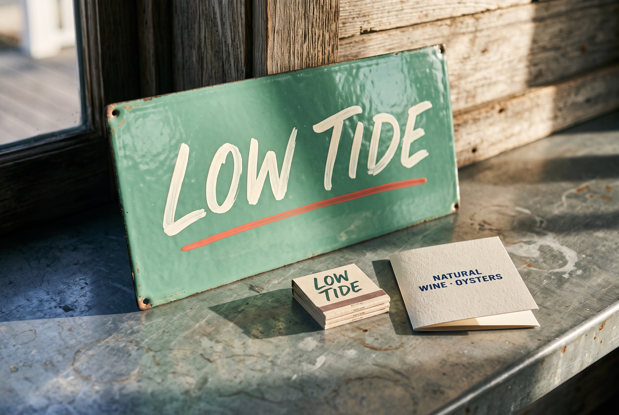
A bar that keeps
the tide's hours.
The brief
Create an identity for a small neighborhood wine bar by the water — warm, unfussy, recognizable from the boardwalk — with a menu system short enough to read at a glance.
The response
The name sets the pace: things slow down at low tide. A loose, hand-painted brush script gives the bar a sign that looks like it has always been there; enamel green, oyster white and a single coral underline keep the palette coastal without a nautical cliché. The menu is one folded card.
Paint the name, don't typeset it.
A brush-script wordmark reads as hospitality rather than a brand. It survives chalk, enamel and matchbook foil equally well.
One card, three columns.
Glass, bottle, dozen. The entire menu system is one folded card with three prices, so the bar never needs a laminated list.
Let the enamel age.
Sea-glass green is chosen to look better scuffed. The identity is designed for salt air, not for a screen.
Script for the sign.
Grotesk for the prices.
The brush script appears exactly once per surface. Everything else — prices, hours, the oyster count — is set in a small, even grotesk so the sign stays the only loud thing in the room.
Brush-script wordmark, sea-glass field, one coral underline, oyster-white type.
Chalk versus enamel versus foil, the day's three prices, the oyster of the week.
Sign: script alone. Menu card: script small, prices large. Matchbook: script and nothing else.
TIDEEnamel signSIGNAGE
TIDEMenu cardGLASS · BOTTLE · DOZEN
TIDEMatchbookPRINT
Application studies / Live type layouts. Final lettering appears in the imagery above.
Seen from
the water.
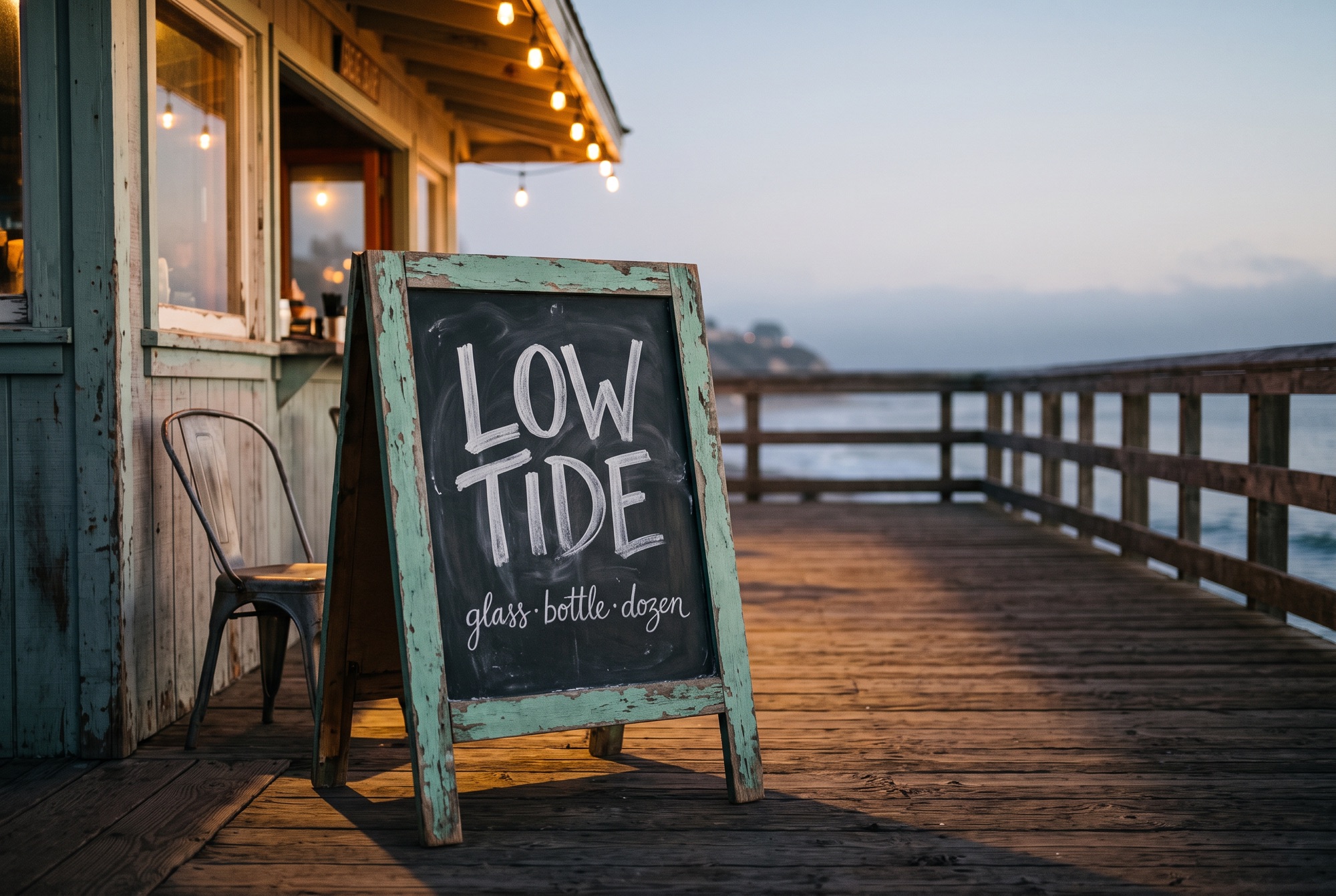
The opening campaign is the sign itself, carried outside: a chalk A-frame, string lights, and the same three words. Posters and a social placement reuse the hero photograph with the script as the only type.
COME IN
AT LOW
TIDE.
Natural wine · oystersGlass. Bottle. Dozen.
Glass. Bottle.
Dozen.
Natural wine barThe next test: paint the script by hand at sign scale and see whether it still reads from the boardwalk.
Project scope & production notes
What this study covers
Brand identity
Menu system
Signage
Concept brief, mark and lettering studies, visualizations, brand rules, typography and application layouts.
What comes next
Before production: commission a sign painter for the final wordmark, proof the enamel green against real sea-glass samples, and test the menu card at bar-top reading distance.
This is an independent fictional brand study, with no client commission or measured commercial results. Concept marks would need vector refinement and supplier validation before production.
PLOT
Landscape architecture studio