fieldnote
Good things.
Clearly stated.
Recipe numbers and ingredient lists become a juice identity.
Brand identity · Campaign · Trade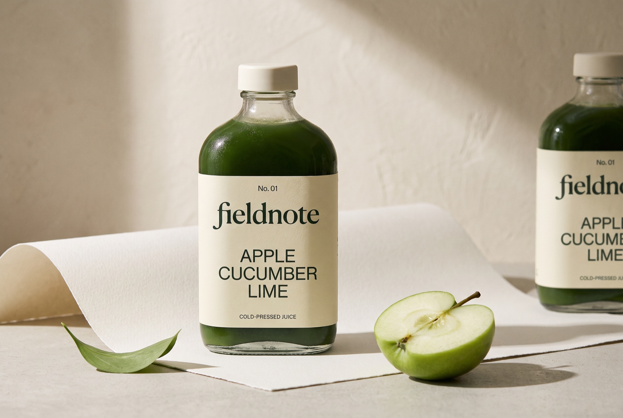
Let the ingredient list
lead the conversation.
The brief
Develop a juice identity that makes its contents easy to understand and turns ingredient clarity into a memorable campaign.
The response
The label borrows the calm logic of a field notebook: a recipe number, a name, and an orderly list of what is inside. A characterful serif adds warmth. The supporting typography stays direct, giving the ingredients room to be the message.
Build an editorial hierarchy.
A lowercase serif wordmark gives the brand a considered voice. A clear sans serif keeps the ingredient list straightforward.
Number the recipes.
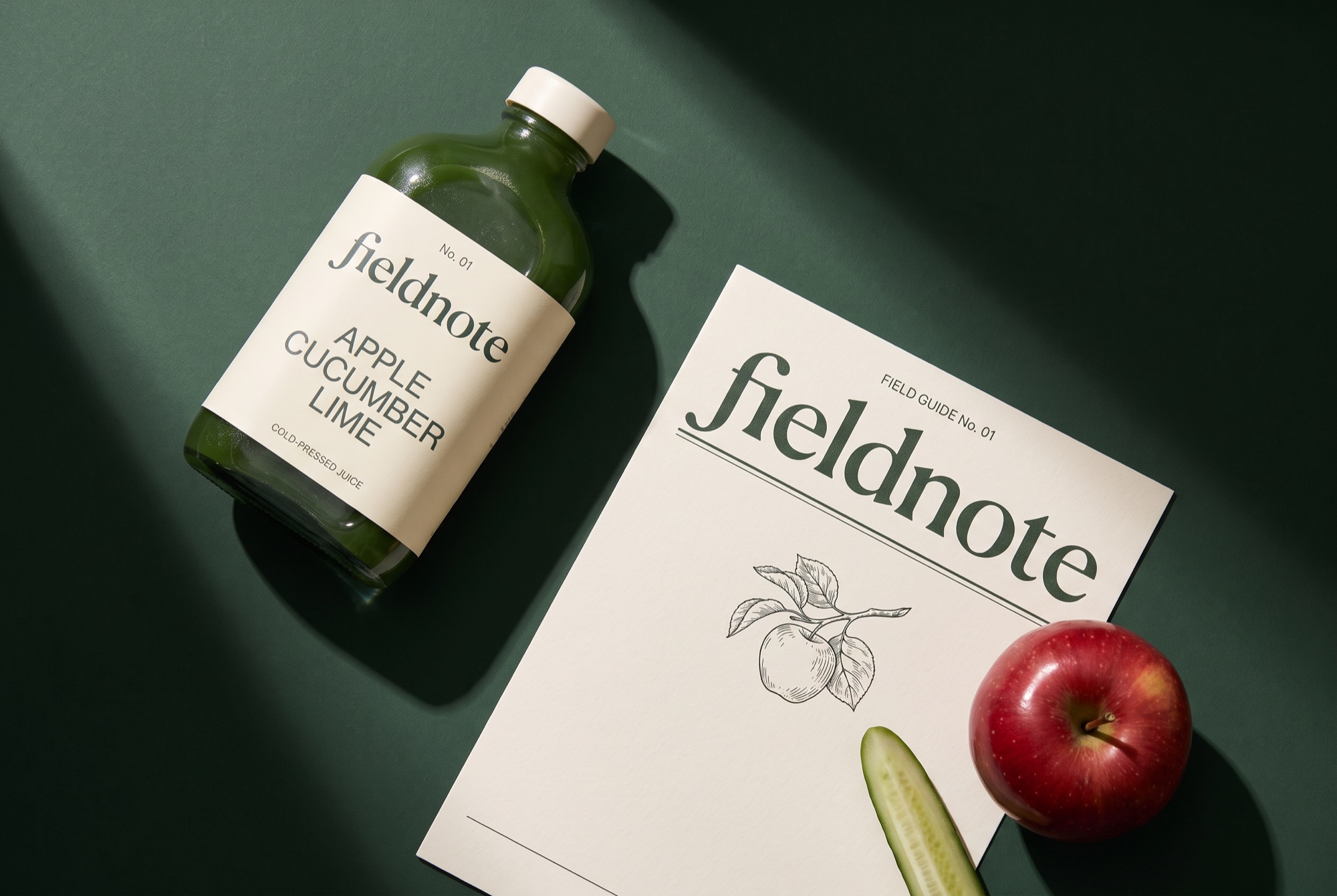
Recipe numbers provide a simple organizing device that can carry from the bottle to a field guide, a social post and a retailer sheet.
Show the materials honestly.
Soft side light, paper texture and sliced produce create a quiet, tactile world around the product.
A label that reads
like a good note.
The identity separates expression from information: an organic serif for the name, a practical sans serif for the ingredients. The recipe number acts as a small but consistent navigation device.
Recipe number, lowercase name, ingredient list. Forest green and paper remain the constant pair.
The recipe number and ingredients. Keep the list in the same position as the range grows.
On the bottle, read name then recipe. In the campaign, enlarge the ingredients. On a trade sheet, make the information scannable.
CUCUMBER
LIMECOLD-PRESSED JUICE
APPLE
GINGERRECIPE EXTENSION
ORANGE
LEMONRECIPE EXTENSION
Hierarchy studies / Live type layouts. Final lettering appears in the product imagery above.
The ingredients
are the headline.
The campaign magnifies the same ingredient-first hierarchy into a poster. For a smaller placement, the recipe number and short ingredient list preserve clarity. A retailer sheet adds structured information without changing the tone.
READ THE
INGREDIENTS.
Cold-pressed juiceApple. Cucumber. Lime.
Recipe No. 01.
Concept / No. 01
Good things.
Clearly stated.
Apple
Cucumber
Lime
Cold-pressed juice
Recipe-led packaging.
Ingredient-first communication.
The next test: does the recipe hierarchy hold at actual bottle size?
Project scope & production notes
What this study covers
Brand identity
Campaign
Trade
Concept brief, lettering studies, product visualizations, brand rules, typography and application layouts.
What comes next
Before production: check label contrast against each juice color, legibility through condensation, and the exact product and retailer information required.
This is an independent fictional brand study, with no client commission or measured commercial results. Concept marks would need vector refinement and supplier validation before production.
SIDEQUEST
Fruit + oat bites