DAYGLOW
A little more
daylight.
A three-flavor soda range built around color and a stacked wordmark.
Brand identity · Packaging · Campaign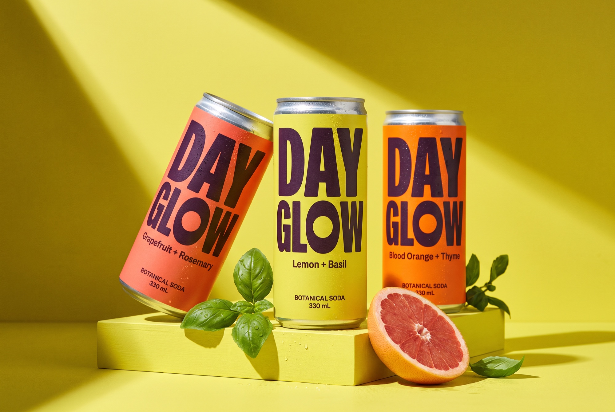
An everyday ritual.
With the brightness turned up.
The brief
Create a botanical soda identity that feels optimistic and full of flavor, with a clear way to distinguish three recipes on a busy shelf.
The response
The idea starts with a small moment: stepping away from the day for something refreshing. That moment becomes the organizing principle. Sun-warmed color, compressed lettering and sharp afternoon shadows make the product feel like a little more daylight.
Make the name the asset.
A large stacked wordmark gives the narrow can a confident, recognizable front. Rounded counters soften its compressed structure.
Keep the system simple.
Each flavor gets a distinct field color. The brand position, category line and information order stay fixed across the range.
Let light do the storytelling.
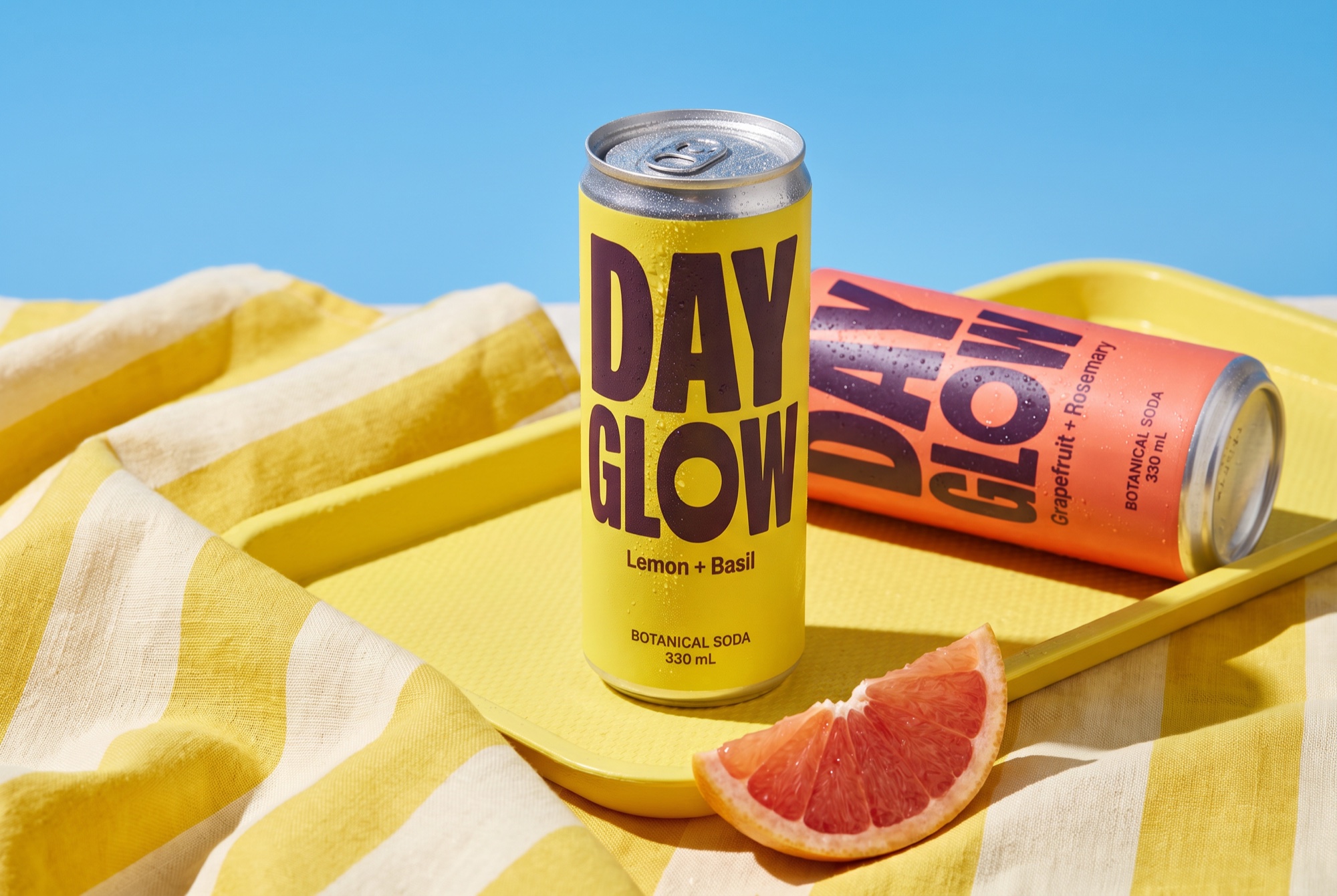
Directional sunlight and real-looking ingredients give the photography energy without filling the frame with effects.
Three flavors.
One unmistakable family.
The structure is deliberately repeatable: wordmark, flavor, category, volume. The label color changes; the hierarchy holds. Supporting campaign type uses the same compact, generous shapes.
Stacked name; category below the flavor; one dominant color per recipe.
Flavor name, pack color and ingredient pairing. Keep the light hard and directional.
On a narrow pack, the name leads. In a poster, the campaign line leads and the pack acts as the signature.
GLOWLemon + BasilBOTANICAL SODA
GLOWGrapefruit + RosemaryBOTANICAL SODA
GLOWBlood Orange + ThymeBOTANICAL SODA
Hierarchy studies / Live type layouts. Final lettering appears in the product imagery above.
Made for the
afternoon pause.
The same visual ingredients move from the pack into a retail poster and a digital placement: one product moment, a short line, and a strong block of color. The composition changes with the format, while the idea stays recognizable.
A LITTLE
MORE
DAYLIGHT.
Botanical sodaBright botanicals.
Lemon + Basil.
Bright botanicals.
Lemon + Basil.
Botanical sodaThe next test: keep the brand recognizable when the flavor color changes.
Project scope & production notes
What this study covers
Brand identity
Packaging
Campaign
Concept brief, lettering studies, product visualizations, brand rules, typography and application layouts.
What comes next
Before production: proof the flavor colors, test the smallest category text at actual size, and map the artwork to a verified supplier dieline.
This is an independent fictional brand study, with no client commission or measured commercial results. Concept marks would need vector refinement and supplier validation before production.
fieldnote
Cold-pressed juice