Bicycle Kitchen
Your hands. Our tools.
A two-color, risograph-style campaign for a volunteer-run nonprofit where people fix their own bikes — an exploded diagram as the hero.
Campaign direction · Hero + story design · Rollout plan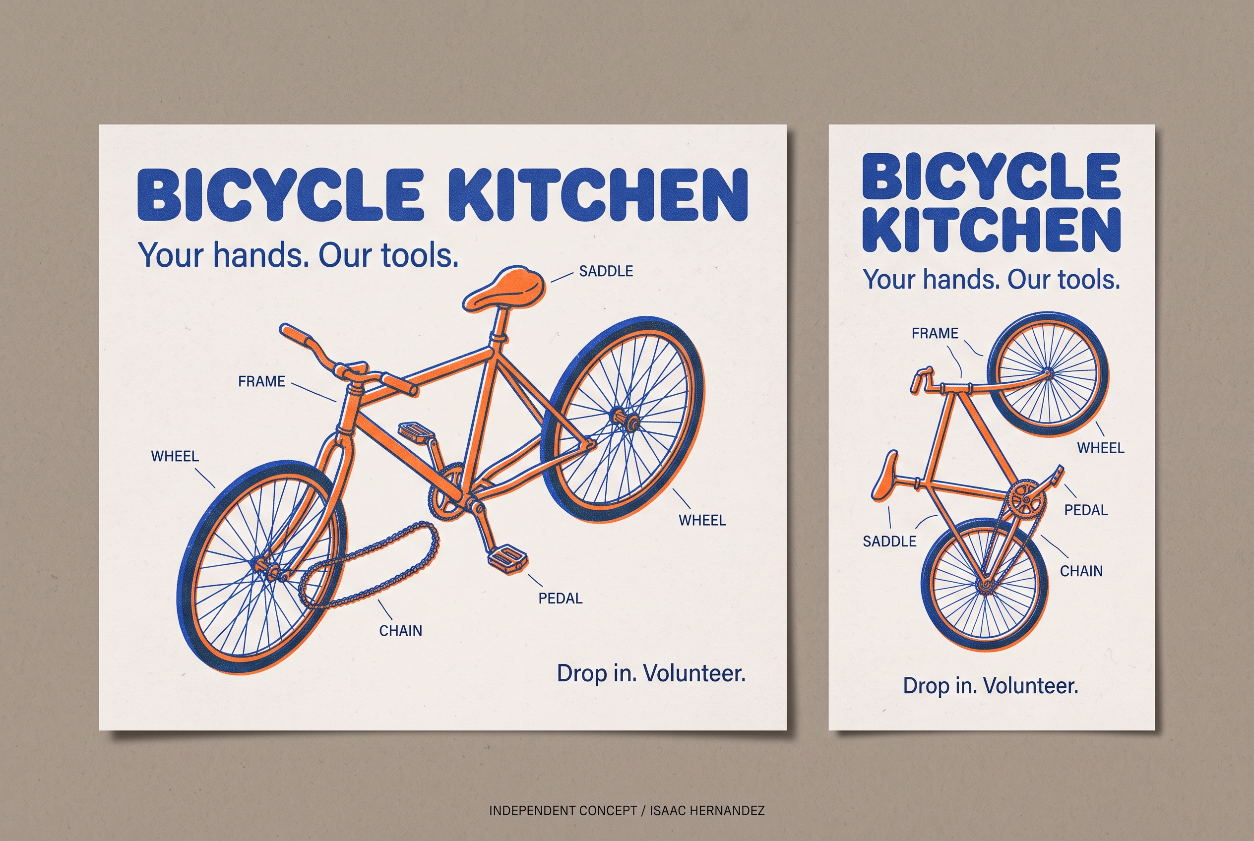
Your hands. Our tools.
Why this line, for this business.
The business
Bicycle Kitchen is a volunteer-run nonprofit in East Hollywood where people learn to build and repair their own bikes during drop-in shifts, with a Youth Build-a-Bike program for ages 12–18.
The goal
One graphic that works for three asks at once — come fix your bike, come volunteer, support the youth program — without looking like a charity appeal.
The central idea
The thing you learn here is how a bike comes apart and goes back together. So the hero is exactly that: an exploded diagram, printed the way community posters are printed — two inks, a little misregistered, on newsprint.
Diagram, not photo.
An exploded bike says ‘you’ll understand this machine’ better than any workshop photo, and it never misrepresents the space or the volunteers.
Two inks, on purpose.
Cobalt and safety orange with visible overprint and grain. It looks hand-made and affordable because it is — the design can be risograph-printed by volunteers.
Friendly, chunky type.
A rounded sans headline with hand-stamped labels. Approachable to a 12-year-old and to someone who has never touched a wrench.
Two inks. Any ask.
The diagram is the constant; the labels change. Point at the wheel for a repair class, the frame for Build-a-Bike, the whole thing for a volunteer call. Everything stays printable in two colors.
Newsprint field, two-ink palette, exploded diagram, rounded-sans headline, stamped CTA.
Which part is highlighted, the headline, and the ask (drop in, volunteer, donate, youth program).
Landscape spreads the diagram horizontally with type left. Vertical stacks the parts top-to-bottom beside a narrow type column.
Two formats.
One identity.
The landscape hero and the vertical story were designed together so the campaign reads the same on a website banner and on a phone. This is the completed, deliverable artwork; everything in section 05 builds on it.
Words that match
the pictures.
Starter copy in the campaign’s voice — a headline, a supporting line, three social captions and an email subject. Written to show the tone; the business would refine every line.
Your hands. Our tools.
Supporting lineA volunteer-run shop where you fix your own bike — and learn how, for next time.
Call to actionDrop in. Volunteer.
- No mechanic. Just you, a stand, and someone who’ll show you. Your hands, our tools.
- Drop-in shifts this week. Bring the bike; we’ve got the rest.
- Twelve to eighteen? Build a bike, keep the bike. Youth Build-a-Bike is open.
Your hands. Our tools — drop-in hours and how to volunteer
Completed assets.
Proposed extensions.
The two completed pieces are the complimentary concept. The rest is how the idea could grow if the business wants to take it further — each would be scoped separately and built from approved brand assets.
Campaign hero · 3:2
The landscape design on the board above.
Vertical story · 9:16
Story version with the parts stacked vertically.
Risograph print files
Two-color separations so volunteers can print posters and flyers in-house.
Youth Build-a-Bike variant
Same diagram, frame highlighted, headline for the program and its age range.
Donation-drive version
Parts bin highlighted; one line about what a donated bike becomes.
The separations are the gift: a nonprofit that can print its own posters in two inks has a brand it can actually afford to use.
Project scope & production notes
What this study covers
Campaign idea
Visual direction
Hero + vertical story design
Sample copy and rollout plan
Created as a complimentary, self-initiated concept and shared with the business as a proposal.
What it is not
An independent concept for a real nonprofit, created without its involvement. The artwork is AI-assisted and illustrative; it does not depict the shop, its volunteers or participants.
No commission, client approval or measured results exist for this work. Motion, print and email items in the rollout are proposals only.
Fugetsu-Do
Soft since 1903.