Fugetsu-Do
Soft since 1903.
A seasonal campaign for a 123-year-old Little Tokyo mochi shop — layered washi circles instead of product shots, and a line that carries the whole history.
Campaign direction · Hero + story design · Rollout plan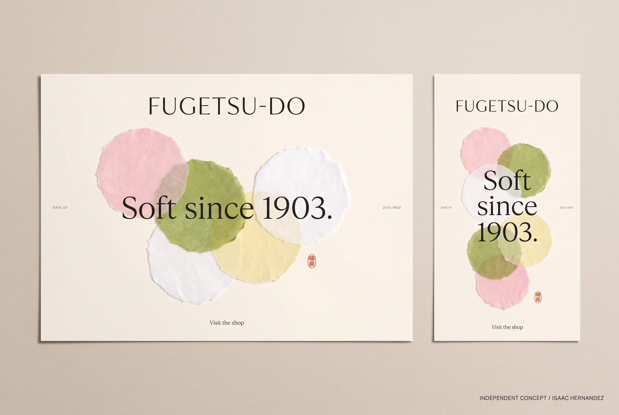
Soft since 1903.
Why this line, for this business.
The business
Fugetsu-Do has made mochi and manju in Little Tokyo since 1903, now under third-generation owner Brian Kito, with seasonal varieties for festivals and holidays.
The goal
Give a shop that never needed advertising a quiet, repeatable way to announce the season — New Year, spring, summer festival — without a single staged product photo.
The central idea
Mochi is softness you can hold. The campaign turns that into paper: layered washi circles, slightly translucent, in the colors of the sweets. The date in the headline does the work no imagery could — a hundred and twenty-three years in two words.
Paper stands in for mochi.
Abstract washi circles suggest the shapes and colors without faking a product. Real photography of the actual sweets can sit in the same frame later.
Let the year be the hero.
‘Soft since 1903.’ is the only claim. One restrained serif, wide tracking, nothing else to compete with the number.
A palette per season.
Pink and green now; red and white for New Year; deeper greens and golds for autumn. The layout holds; the circles recolor.
Circles, cream, one red mark.
A cream field, a cluster of paper circles and one small vermilion mark — the structure of a seasonal card. Change the circle colors and the line under the headline, and the shop has a post for every festival on the calendar.
Cream field, wide-tracked serif headline, small tracked brand name, one vermilion mark, deckled paper edges.
Circle colors and arrangement by season, and the small line naming the occasion.
Landscape clusters the circles to one side of the headline. Vertical lets them drift top-to-bottom behind it.
Two formats.
One identity.
The landscape hero and the vertical story were designed together so the campaign reads the same on a website banner and on a phone. This is the completed, deliverable artwork; everything in section 05 builds on it.
Words that match
the pictures.
Starter copy in the campaign’s voice — a headline, a supporting line, three social captions and an email subject. Written to show the tone; the business would refine every line.
Soft since 1903.
Supporting lineMochi and manju made by hand in Little Tokyo for three generations.
Call to actionVisit the shop
- Same street. Same family. Same soft. Since 1903.
- The season changes. The recipe doesn’t. New flavors in the shop this week.
- A hundred and twenty-three years of saying it with mochi.
Soft since 1903 — this season at Fugetsu-Do
Completed assets.
Proposed extensions.
The two completed pieces are the complimentary concept. The rest is how the idea could grow if the business wants to take it further — each would be scoped separately and built from approved brand assets.
Campaign hero · 3:2
The landscape design on the board above.
Vertical story · 9:16
Story version with the circles drifting behind the headline.
Seasonal set
New Year, spring and summer-festival recolors, delivered as matched hero + story pairs.
Box insert card
The same cream-and-circles card tucked into gift boxes, with the 1903 line.
Product round two
Approved photographs of the actual sweets placed among the paper circles.
The next step is the New Year version: if red-and-white circles still read as Fugetsu-Do, the seasonal system works for a century more.
Project scope & production notes
What this study covers
Campaign idea
Visual direction
Hero + vertical story design
Sample copy and rollout plan
Created as a complimentary, self-initiated concept and shared with the business as a proposal.
What it is not
An independent concept for a real business, created without its involvement. The artwork is AI-assisted and illustrative; the paper shapes are abstract and do not depict Fugetsu-Do’s sweets or shop.
No commission, client approval or measured results exist for this work. Motion, print and email items in the rollout are proposals only.
Lacausa
Made here. Worn everywhere.