Brooke Callahan
Dyed by hand. Cut to move.
A color-drop campaign for an Echo Park label that designs, dyes and sews in-house — dye-bath fields bleeding into each other.
Campaign direction · Hero + story design · Rollout plan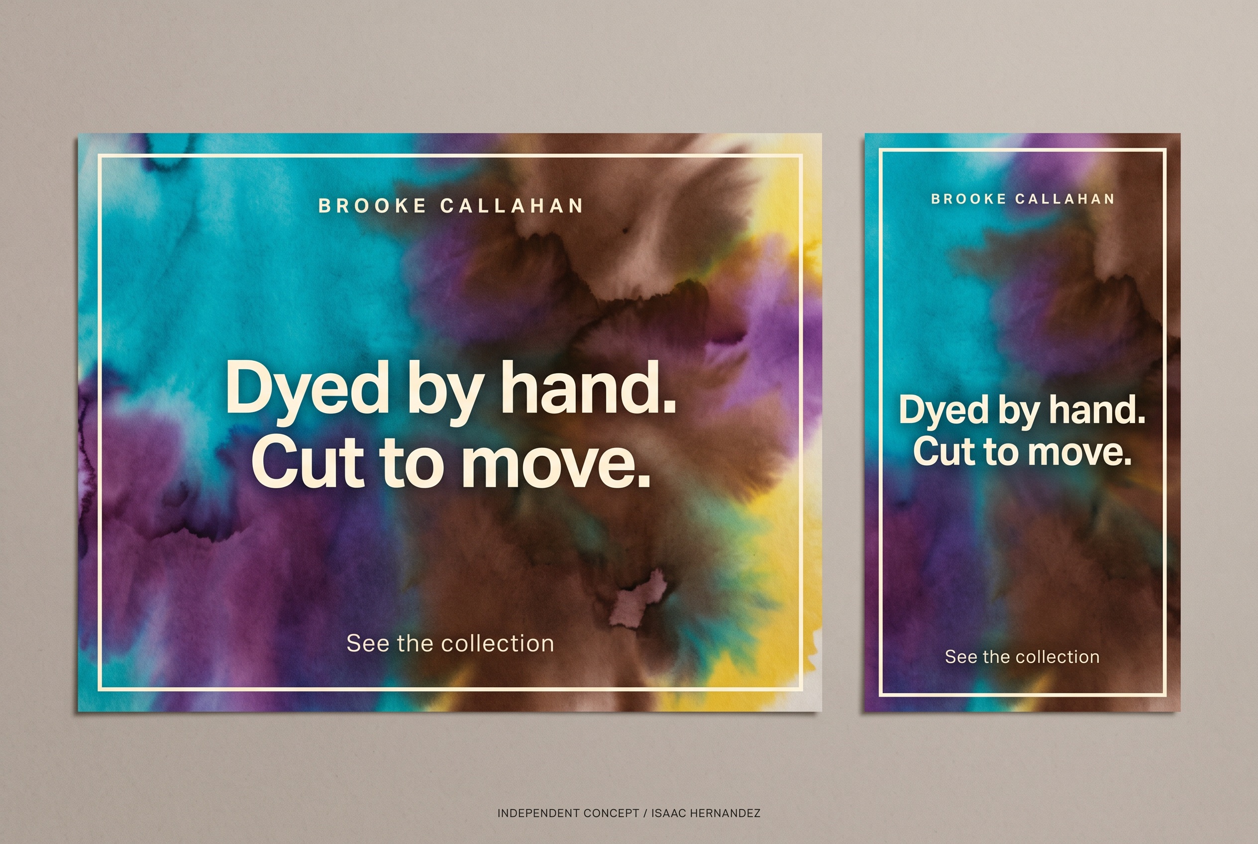
Dyed by hand. Cut to move.
Why this line, for this business.
The business
Brooke Callahan is an independent womenswear label whose pieces are designed, dyed and sewn by a small team in Echo Park, in a wide, confident color range.
The goal
Turn the label’s two real differentiators — hand-dyeing and a bold palette — into a campaign format that can announce every new color drop.
The central idea
Show the dye, not the dress. Four of the label’s colors bleed into each other the way wet dye moves on fabric, pooling and feathering at the edges. The headline names the two things the studio does by hand.
Dye as the image.
Color fields with soft, wet edges are unmistakably about process, and they never fabricate a garment or a model.
Palette straight from the rack.
Turquoise, purple, chocolate, yellow — pulled from the actual colorways, so the campaign and the shop agree.
Geometric sans in cream.
A confident, slightly wide sans knocked out of the color. It holds its own against saturated fields without shouting.
Four colors in. One drop out.
The border and the type are fixed; the dye field changes with every drop. Over a season the posts become a swatch book of what the studio has been mixing.
Cream border, bleeding dye field, geometric sans headline in cream, small tracked brand name.
The colors in the field (the drop’s colorways) and the headline.
Landscape lets the colors run left-to-right. Vertical stacks them top-to-bottom so each color gets a band.
Two formats.
One identity.
The landscape hero and the vertical story were designed together so the campaign reads the same on a website banner and on a phone. This is the completed, deliverable artwork; everything in section 05 builds on it.
Words that match
the pictures.
Starter copy in the campaign’s voice — a headline, a supporting line, three social captions and an email subject. Written to show the tone; the business would refine every line.
Dyed by hand. Cut to move.
Supporting lineDesigned, dyed and sewn in Echo Park by a very small team. New colors, same hands.
Call to actionSee the collection
- Turquoise, purple, chocolate, yellow. All mixed this week. Dyed by hand, cut to move.
- Every color on the rack started in a bucket in Echo Park. See the collection.
- No two dye lots match exactly. That’s the point.
Dyed by hand. Cut to move — new colors in the shop
Completed assets.
Proposed extensions.
The two completed pieces are the complimentary concept. The rest is how the idea could grow if the business wants to take it further — each would be scoped separately and built from approved brand assets.
Campaign hero · 3:2
The landscape design on the board above.
Vertical story · 9:16
Story version with the colors stacked as bands.
Color-drop template
A reusable layout where each new colorway gets its own dye field and post.
Motion cut
The dye blooms across the field in real time; the headline resolves last. Six seconds.
Swatch card
A printed card of the season’s dye fields to tuck into orders.
The template is the deliverable: one layout, a new bucket of color every drop.
Project scope & production notes
What this study covers
Campaign idea
Visual direction
Hero + vertical story design
Sample copy and rollout plan
Created as a complimentary, self-initiated concept and shared with the business as a proposal.
What it is not
An independent concept for a real business, created without its involvement. The artwork is AI-assisted and illustrative; it does not depict Brooke Callahan’s garments or studio.
No commission, client approval or measured results exist for this work. Motion, print and email items in the rollout are proposals only.
Covell
Choose an adjective.